Tuesday, 26 April 2011

Final Designs for Music Magazine Front Cover, Contents Page and Double Page Spread

After taking feedback when work was in progress I have completed my designs for my music magazine front cover, contents page and double page spread.


Work in Process - Audience Feedback towards Music Magazines

Part way during the process of designing my music magazine front cover, contents page and double page spread I proceeded to get audience feedback from my peers, family members and friend to try and improve my design for them. I have annotated my draft designs to show what people have said, with the positive comments highlighted in green and the negative comments highlighted in red


From this task I have learnt how I can now improve my designs. 
I plan to:
  • Add more information to the Front Cover, more stories.
  • Make the main story take up less space on the contents page so it doesn't neglect the other stories
  • Get a more fitting photo for the contents page
  • Change the colours on the Double Page Spread background
  • Change the colour of writing and boxes to make it easier to read
  • Divide up the boxes differently
  • Add a group photo of the band to the double page spread
  • Try and make it look More professional


Post Photo Shoot

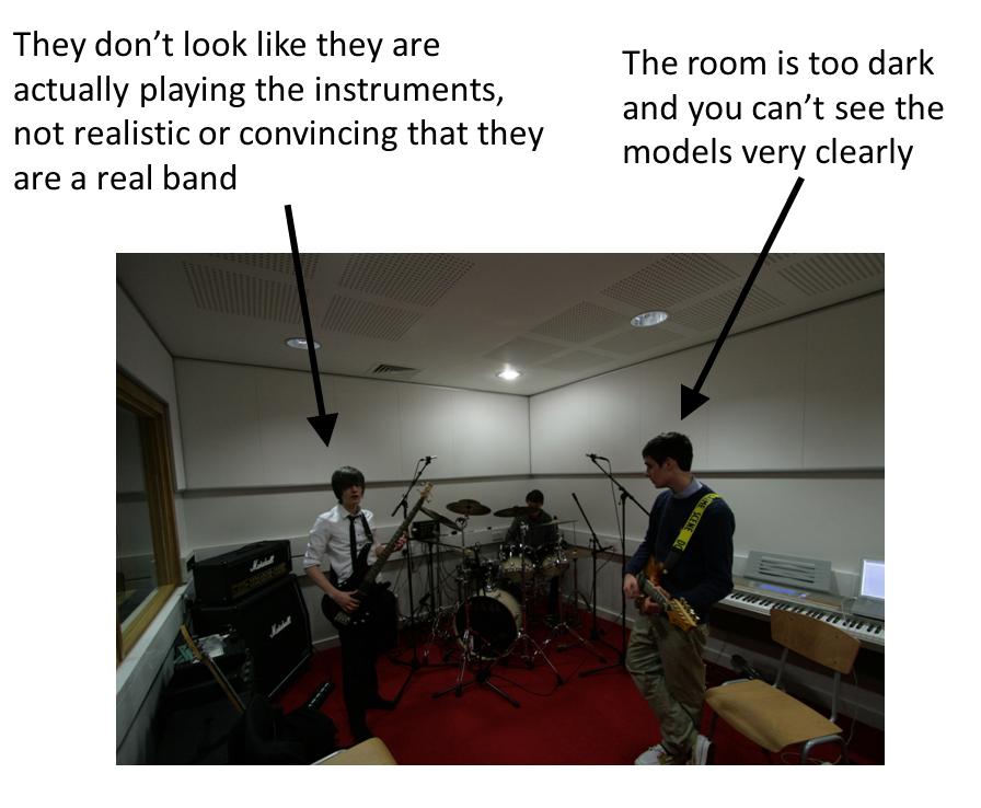
After the photoshoot there was a selection of photos that were not good enough to use in my music magazine. Here I have given a few examples of the photos I did not use and why I didn't use them


I then settled on which photos I would use in my designs. These are the photos I chose and why:
All looking at the camera, grabs attention, have attitude

Looking into the camera, connects with the reader

Looking at the camera and smiling, looks happy and as if he is having fun

Cheeky grin, looks happy and as if he is having fun, will help the readers connect with him

Giggling, having fun which connects with the reader

Messing about in the studio, makes the band look fun.

I have also taken this photo which I took at a gig I attended which I may use on my contents page. It looks effective as the singer is in the centre of the page and the focus of the photo


Music Magazine Photoshoot plan

Next I planned my photoshoot that I need for my music magazine. I wrote down what shot was needed, how many people, what their costume would be, if there were any props required, where the shoot(s) would take place and what camera would be used to take the photo


Monday, 25 April 2011

Masthead Design


After trying out possible fonts for my masthead/logo I settle on the 'Stencil' font (shown below)
I chose this font because it is big, bold and stands out as quite 'military', which references the Indie/Rock genre attitude of being rebellious that I mentioned in my digitial collage. It also references the idea that music fans are like armies to their favourite bands.


I then decided to edit this to make it stand out more and give it an edge, something different. I used the 'Fireworks' program to add 'Bevel' to the font to make it stand out and look like it's coming off the page at you and make it look like it's really there, not just on a magazine cover. I made the 'E' of 'ECHO' red to add some colour to the logo, but kept the main colour as black with red as a secondary colour to fit in the with my chosen genre's attitudes.


I also created the same logo but with white instead of black so it could be used on the magazine where the background is dark so it could be seen clearly


Tuesday, 19 April 2011

Sketch Design Ideas

After deciding on the name ECHO for my magazine I sketched three possible front covers, a contents page and a double page spread as design ideas for my music magazine to help decide what font/colours/layout I will use


These designs helped me decide what font, layout, style and colour scheme I will be using for my magazine


After using my mind-map to brainstorm possible ideas for the name of my magazine I settle on the name 'ECHO'. I chose this because it is simple but also has a lot of impact. It could also reference the echoing of music or rumours etc which will be in the magazine. Next I decided to try out different fonts that could be used for the masthead and logo


Monday, 18 April 2011

I have designed a mindmap to help decide what would be included in the magazine, who the target audience is and possible names for the magazine

Here is my Digital Collage for my Music Magazine Research

I have made a digital collage to help gain ideas about what people who like my music genre (indie/rock) enjoy to try and help design my music magazine for this genre
I have annotated my collage to talk about what I have found.